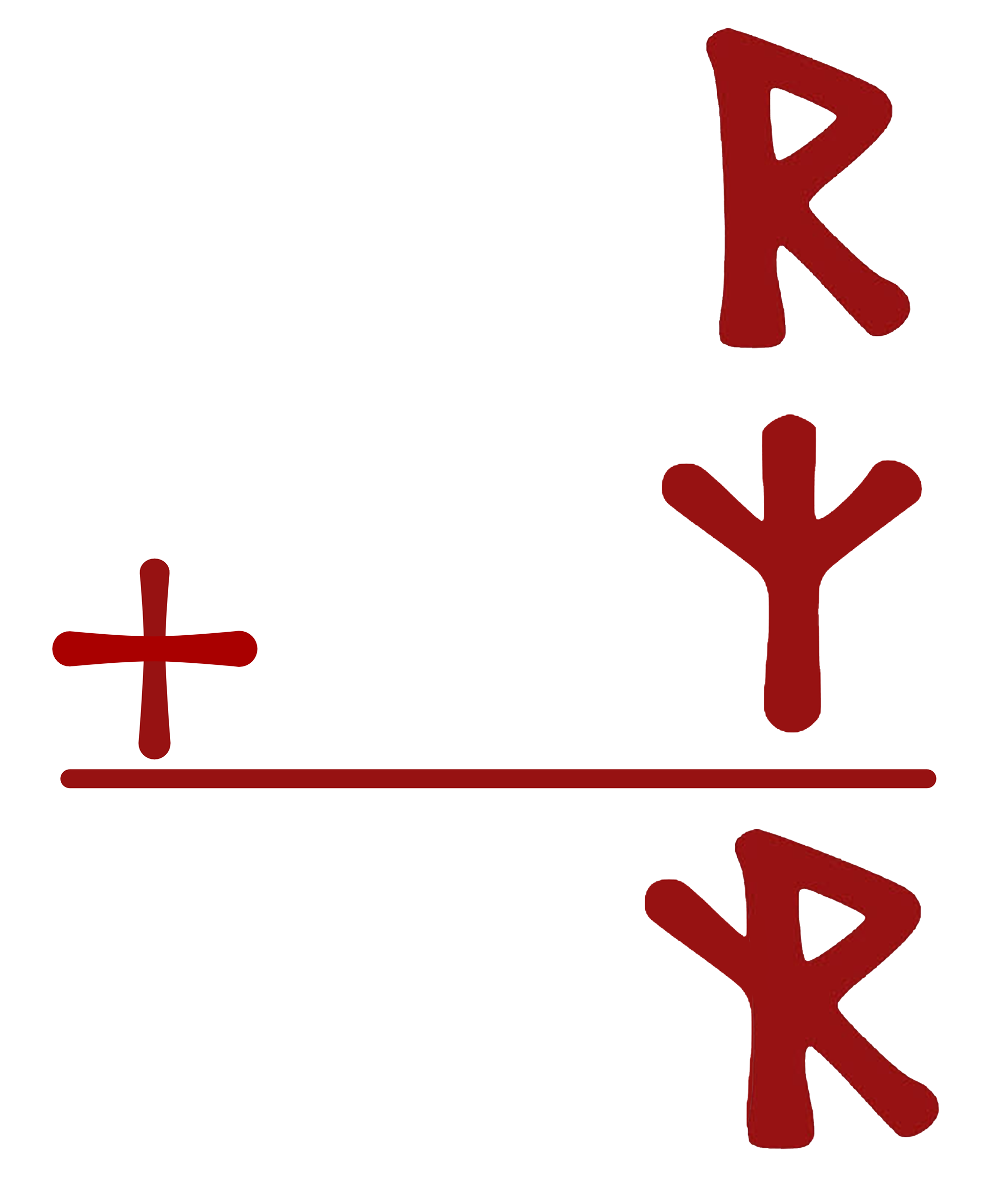
For the start of this journey we got to work developing the first graphic tee design of the collection. Laura first wanted me to develop a tee to introduce the idea of the rune Gizho: a combination of the Norse runes Raidho and Algiz
Additionally, these first line of shirts would be initially produced through Canva's printing options, so I looked to make a design that took advantage of Canva's small print space for apparel graphics and took up the entire print space to make these graphics more intriguing from a distance.
This led me to looking at many other graphic tee designs. I was especially enamored by Japanese designs that tend to have a high volume of text or just pure typography, and sought to incorporate similar ideas in my design. This led me to blocking out a first rough draft of what I would envision as the 'Gizho' shirt.
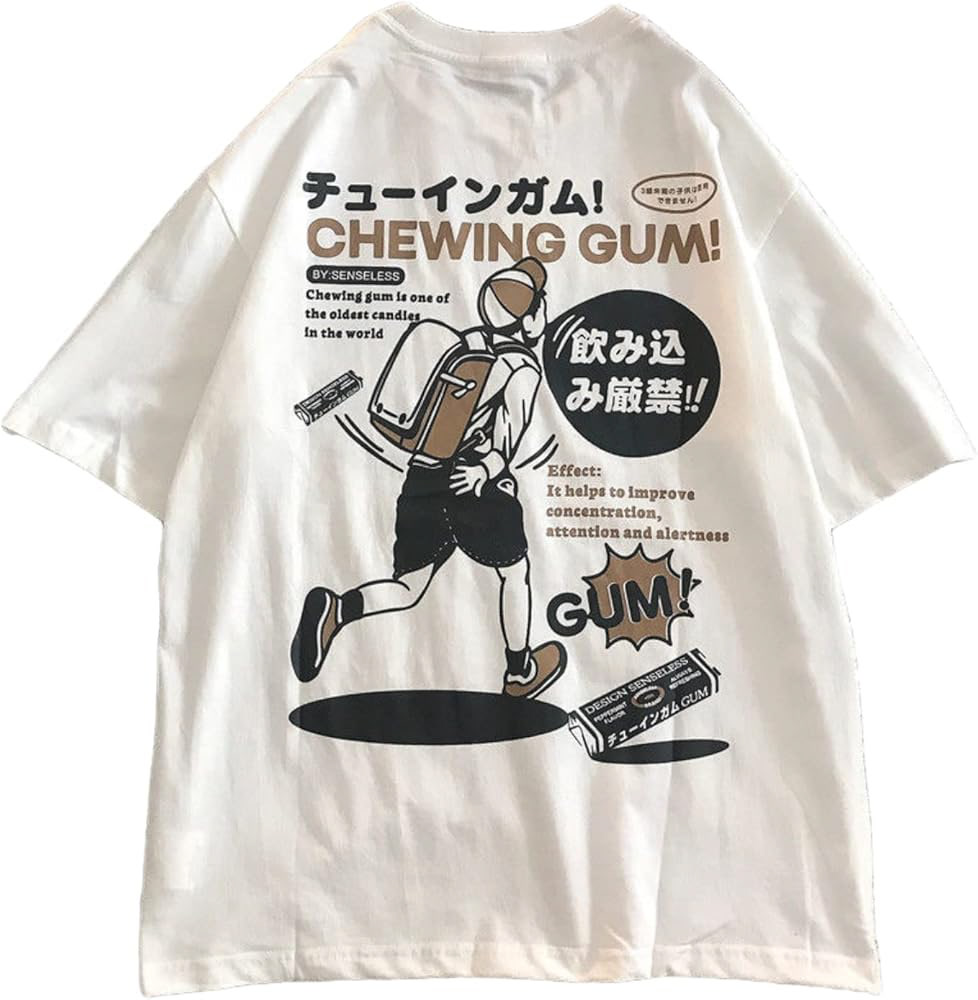
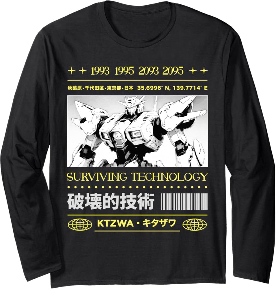
I think, however, these shirts are developed with a much more distinct design in mind as well as coming with a much solid visual identity. At this point in the process, the remixed brand was not quite developed to the point where a design like this could take hold, and so Laura looked towards a design farther off from this idea of a highly dense composition. If I were to try to make this initial design again for a client's consideration, I would try to take a little more care in making sure I had a solid brand footing. As it was, the initial draft was too static across the composition as well as the first
After considering this initial design, we instead looked to find something that
